%20(1).png)
The Perfect Logo: More Than Just Pretty Pictures – It's Data-Driven Identity with Clark and Davenport's Lynk℠
- clarkdavenport
- Jun 26, 2025
- 13 min read

Have you ever stared at a blank canvas, or a dozen conflicting design drafts, agonizing over that elusive "perfect logo"? You know it's supposed to embody your entire brand, speak volumes without saying a word, and resonate deeply with your audience. Yet, the process often feels like throwing darts in the dark, hoping one randomly sticks
– and more often, just bounces off with a disheartening thud. You've seen the eye-catching emblems that seem to effortlessly capture market attention, and perhaps, with a sigh, wondered: Why isn't my brand's visual identity making that kind of impact? Or, dare I ask, why does it look like it was designed by a committee of well-meaning but ultimately confused pigeons?
We understand. At Clark and Davenport℠, we know the creative journey, especially when tied to the core of your brand identity, can be fraught with subjective opinions, endless revisions, and the quiet despair of "does this even work?" You’re busy cultivating your business, serving your clients, and frankly, trying to remember if you’ve had a moment of pure, unadulterated peace this week that didn't involve staring blankly at a wall. The last thing you need is another design phase that feels like an expensive guessing game, with the grand reveal being met with polite but utterly unenthusiastic nods.
Consider this your definitive guide – not a design tutorial, heaven forbid, but a strategic exposition. We’ll dismantle the artistic mystique around logo creation, expose the profound power of a truly effective visual identity, and, crucially, demonstrate how Clark and Davenport’s proprietary Lynk℠ engine provides the precise, data-driven blueprint your brand needs to not just look good, but to genuinely connect and convert. After all, relying on purely subjective aesthetic preferences for your core brand identity is a bit like building a house without blueprints; it might stand, but you'll certainly be replacing the roof prematurely, and explaining why the bathroom is in the garage.
The Logo Demystified: What It Is (Beyond the Pretty Sketch, or the Napkin Doodle)
Let's begin with the essence. What is a logo, truly? Forget the whimsical doodles and subjective color debates for a moment; we'll leave those for the art school critiques. At its essence, a logo is the visual cornerstone of your brand identity. It's the most distilled, most immediate representation of who you are, what you do, and what you stand for. It’s the digital handshake, the silent pitch, the instant recognition – all without the awkwardness of actual human interaction.
Think of it as your brand's face in a crowded room. In a world saturated with fleeting attention spans, where the average person scrolls past more content in an hour than they used to see in a day, your logo isn't just decoration; it’s a strategic communication tool. It needs to cut through the noise, convey professionalism, elicit emotion, and be instantly memorable. A bad logo is like a mumbled introduction – easily forgotten, and frankly, a bit awkward, leaving everyone wondering if they missed something important (they didn't). A great logo, however, is a captivating introduction that leaves a lasting, positive impression, subtly hinting at the depth and quality behind it. It's the visual equivalent of walking into a room and owning it, without having to announce your credentials with a megaphone.
Ultimately, a logo’s objective boils down to one singular truth: flawlessly communicating your brand's essence and resonating with your target audience on a fundamental, often subconscious, level. It’s about building recognition, trust, and distinction in a market that rarely tolerates ambiguity – or, for that matter, visual confusion. It's a meritocracy of visual communication, where clarity and resonance invariably elevate your standing, and anything else sends you directly to the digital equivalent of Siberia.
The Strategic Imperative: Why Your Logo Is Your Most Potent Brand Asset (Unless You Prefer Anonymity, or Operating a Secret Society)
If you're still viewing your logo as merely a necessary graphic, a box to check on your business setup list, a mere stamp of existence, consider this a gentle but firm re-evaluation. In today’s visually driven, interconnected marketplace, your logo isn't just important; it's foundational. Unless your business model relies solely on telepathy, ancient scrolls, or a secret handshake passed down through generations, this is for you.
Instant Recognition: The Unyielding Opportunity. Let's be blunt: In a sea of competitors, where everyone is vying for precious eyeball real estate, your logo is often the very first, and sometimes only, visual cue a potential customer receives. It’s the banner under which you march – or, if your logo is unremarkable, perhaps merely a faded handkerchief. A memorable logo ensures your brand registers immediately, fostering recall and cutting through the visual clutter. If your logo is forgettable, you’re not just losing mindshare; you’re effectively opting for digital obscurity. Imagine trying to identify a leading brand without seeing their logo – it’s certainly a challenge. Your logo ensures you’re not just present, but unequivocally identifiable, perhaps even with a subconscious nod of approval from your audience, a silent acknowledgment that says, "Ah yes, them."
Credibility & Inherent Trust. There’s an implicit, almost subconscious, trust afforded to brands with professional, well-conceived logos. It signals maturity, reliability, and an attention to detail that suggests, perhaps, you actually know what you're doing. A poorly designed or generic logo, conversely, can inadvertently sow seeds of doubt about the quality of your products or services. It's the digital equivalent of showing up to a black-tie event in pajamas – comfortable, perhaps, but certainly not inspiring confidence. In the court of public perception, a strong logo is less a suggestion and more an authoritative endorsement for your entire enterprise. It’s the visual equivalent of a glowing recommendation before a customer even engages with your product, which, let's face it, saves you the trouble of earning every micro-ounce of trust the hard way.
Market Differentiation: Standing Out in the Noise. This is where a truly effective logo shines. In crowded markets, where businesses often blend into a homogeneous grey, a distinctive logo can be your most powerful tool for differentiation. It allows you to carve out a unique visual space, signaling what makes you different, better, or simply, you. It’s the profound difference between being one of many indistinguishable pebbles on a beach and being that singular, striking gem that catches every eye. Your logo isn't just about looking good; it's about strategizing distinctiveness. Because blending in is a strategy, certainly, but usually for those who prefer to remain unnoticed.
Emotional Connection: The Unseen Bridge. Beyond mere recognition, the perfect logo can skillfully evoke specific emotions, values, and associations. Color psychology, form, and typography all play roles in shaping how your brand is perceived on a visceral level. A well-designed logo can forge an immediate emotional bond, aligning your brand with positive feelings and memories, sometimes even before a single word is read. It allows you to tailor your visual language not to what you think they want, but what resonates with their values, saving you the awkwardness of trying to sell a luxury product with a discount store emblem – a sartorial blunder of the highest order.
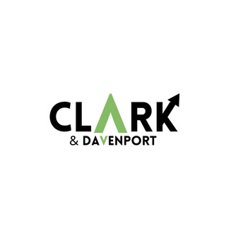
Beyond the Surface: The Clark and Davenport℠ Logo Story. If you're wondering how deeply we believe in the power of meaningful design, where every pixel has a purpose, one need only look at our own logo. The prominent 'A' in Clark isn't merely a letter; it’s a subtly designed mountain peak, symbolizing the heights of success we aim to reach with our clients. And the 'V' in Davenport? That's its inverse, a reverse mountain peak. This isn't just a clever visual trick; it’s a deliberate testament to our commitment to ride the highs and the inevitable lows with your company. Because every business journey has its glorious summits and its challenging valleys, and we're here for the entire expedition, armed with a compass and a survival kit. Even our signature green isn't arbitrary; its hex code (something of a digital fingerprint, if you will) directly corresponds to #85bb65, a hex code often associated with the color of the U.S. dollar bill. A subtle nod, perhaps, but one that unequivocally communicates the immediate, tangible, and dare we say, monetary value we bring to your table. Every detail, designed with intent. Because while aesthetics are lovely, results are divine.
Versatility & Adaptability: Future-Proofing Your Brand. A truly strategic logo isn’t just designed for today; it’s built for tomorrow. It must function flawlessly across myriad platforms – from a giant billboard (so your message isn't lost to the pigeons) to a tiny app icon (so it doesn't become an unidentifiable smudge), from print ads to social media profiles. A logo that doesn't scale, doesn't translate, or doesn't feel right in every context is a liability – a digital ill-fitting suit, if you will. Your logo should be a chameleon, subtly adapting its presentation without losing its core identity. Because if your logo frustrates your marketing team by not fitting into various digital spaces, it certainly won’t impress your tech-savvy customers, and we all know who's really driving the digital trends (hint: it's not the Luddites).
The Architecture of the Perfect Logo: Peeling Back the Layers of Design Science (Without the Lab Coat)
To truly grasp what makes a logo perfect, it helps to understand its foundational components. Think of them as the pillars supporting your brand's visual identity. Neglect one, and the whole structure might just wobble, potentially leading to a rather undignified brand collapse that's expensive to clean up.
A. Simplicity: The Foundation of Memorability. This isn't about being simplistic, like a child's crayon drawing; it's about surgical precision. The most iconic logos are often the simplest. Why does it matter so profoundly? Because simplicity ensures instant recognition and easy recall. An overly complicated logo is, frankly, charmingly optimistic in its desire to convey everything at once, and about as effective as trying to explain quantum physics in a single tweet while simultaneously juggling flaming torches. This is your brand's concentrated essence – ensuring your message is not just heard, but understood at a glance, no decoder ring required.
B. Memorability: Sticking in the Mind's Eye. A great logo is unforgettable. It lodges itself in the viewer's memory, creating a lasting impression that transcends fleeting exposure. This is achieved through unique forms, intelligent use of negative space, and a distinct character. It’s about being remarkable, not just visible. Because even search engines prefer a well-designed narrative to a broken record, and your audience certainly does. If they can't remember it, did they ever really see it?
C. Versatility: The Chameleon of Branding. As mentioned, a logo must perform flawlessly across all mediums and sizes. This demands a design that maintains its integrity whether it's embroidered on a uniform, splashed across a billboard, or shrinking down to a favicon. A logo that loses its impact when scaled is a strategic misstep – like a meticulously crafted miniature portrait that turns into an unrecognizable blob when blown up to mural size. This is your brand's adaptability – its ability to thrive in any environment without losing its core identity, much like a seasoned diplomat fluent in every language.
D. Relevance: Speaking to Your Audience. A perfect logo resonates with your target audience and accurately reflects your industry and brand values. A whimsical, playful logo for a law firm, while perhaps "creative," might send a rather confusing message – unless, of course, your law firm specializes in clown-based litigation. This is about precision-matching your visual identity to your market's expectations and your brand's promise. It ensures your first visual impression is the right one, avoiding awkward first dates.
E. Timelessness: Enduring Beyond Trends. Trends are fleeting; true style endures. A timeless logo avoids fads, ensuring longevity and saving your business the constant headache (and expense) of frequent rebrands. Because constantly chasing the latest visual whim is not only costly but also sends a subtle message that your brand might be a bit... unmoored. While some elements may evolve, the core essence should remain robust for decades. This is your brand's legacy – built to withstand the whims of design evolution, much like a classic tailored suit never goes out of style.
F. Emotional Resonance: The Heart of the Matter. Beyond aesthetics, a logo should skillfully evoke the desired emotions and associations. Is your brand trustworthy? Innovative? Approachable? The colors, typography, and iconography should subtly convey these attributes, forging a subconscious connection with your audience. It's about designing for feeling, not just for sight. Because if your logo leaves people feeling nothing, you've missed the point entirely.
The Clark and Davenport℠ Difference: Blueprinting Your Iconic Identity with Lynk℠
Now, you might be thinking, "This all sounds like a fascinating art critique mixed with business strategy. How do I actually create this 'perfect logo' without developing a nervous tic, or worse, succumbing to the dreaded 'design-by-committee' nightmare where everyone has an opinion and nobody has a clue?" This is where the pervasive frustration with generic design services often sets in. Many businesses receive "solutions" that are disappointingly boilerplate, failing to account for their distinct industry, nuanced target audience, competitive labyrinth, or precise strategic objectives. It’s a design, but perhaps not your design – more like a generic wallpaper pattern you'll tire of in a year.
This is precisely where Clark and Davenport’s proprietary, in-house intelligence engine, Lynk℠, distinguishes itself. Lynk℠ is not merely a piece of software; it is an intelligent, adaptive, and relentlessly analytical framework meticulously designed to architect genuinely personalized, data-driven brand identities. Other firms might have talented designers; we have a system built for your victory, ensuring your logo isn't just pretty, but powerfully effective – a true workhorse, not just a show pony.
How does Lynk℠ move beyond the generic to cultivate a truly customized, high-impact logo for your business?
Deep-Dive Intelligence: Beyond Subjectivity. Lynk℠ capabilities extend far beyond superficial aesthetic preferences. It conducts a forensic examination of your market, your competitors, consumer psychology, and the precise, often subtle, nuances of your target audience's visual preferences and cultural associations. This granular, data-driven analysis allows us to unearth visual opportunities and pinpoint the exact design elements that will resonate most profoundly and uniquely with your business. We don't just see shapes and colors; we interpret their statistical impact on perception and recall. Because while generic solutions are efficient, they rarely lead to iconic status. And who wants to be just 'efficient' when you can be 'legendary'?
Precision-Engineered Design: No Room for Guesswork. We reject one-size-fits-all methodologies. Lynk℠ is the crucible within which bespoke logo concepts are forged – meticulously calibrated to your specific objectives, whether that entails establishing trust in a conservative industry, sparking innovation in a tech startup, or evoking warmth in a consumer brand. Your business is unique; your visual identity should be too. Anything less would be, frankly, a disservice to your ambition, and a missed opportunity for market dominance that your competitors would happily seize.
Dynamic Adaptation: The Future-Proofing Protocol for Your Visual Identity. The brand landscape, much like the business world, is in perpetual flux. Lynk℠ tirelessly monitors visual trends, competitive shifts, and consumer perception. This proactive vigilance enables us to dynamically refine and validate design choices, ensuring sustained relevance and peak performance of your logo. We don’t just design for today; we ensure your visual asset is built to last, with a knowing smirk at those whose logos are already looking dated faster than last year's smartphone.
Holistic Integration: The Unified Approach, Powered by Dynamic Living Blueprints™. The perfect logo isn't an isolated work of art, hung proudly on a wall never to be seen again; it's a vital, integrated component of Clark and Davenport’s overarching Dynamic Living Blueprints™ – our trademarked, comprehensive strategy and business plan designed to ensure every element of your business works in perfect concert. Lynk℠ seamlessly integrates the insights gleaned from market data into a cohesive visual strategy, ensuring your logo harmonizes with your broader brand messaging, marketing efforts, and strategic objectives. Managing your strategic plan, marketing, and visual identity separately often feels like conducting an orchestra where no one has the sheet music, and the conductor is constantly wondering where the cellos went. Our approach, rooted in these living blueprints, ensures everyone's playing the same tune, and that your logo isn't just an image, but a powerful instrument in your brand's symphony.
Data-Driven Cultivation: Insights, Not Just Intuition. Lynk℠ output isn't a mere portfolio of pretty designs that leave you scratching your head wondering if they'll actually work in the real, unforgiving world. It meticulously translates complex data on consumer psychology, visual hierarchy, and brand recall into actionable design principles, empowering our expert team to cultivate logo concepts that will yield the most profound impact for your brand. We provide the map, the compass, and the seasoned guide to iconic identity. A brilliant design without data-backed effectiveness is just a fascinating art piece. Our blueprints are designed to ensure your logo works tirelessly for you. Because while intuition is charming, verifiable results are far more convincing.
Your Invitation to Iconic Identity: A Strategic Consultation (No, We Won't Just Ask You What Colors You Like)
At Clark and Davenport℠, we fundamentally believe in empowering businesses with unassailable knowledge and actionable solutions. It is with this ethos that we extend an invitation for a strategic consultation on your brand's visual identity, powered by the unparalleled insights of Lynk℠.
What it delivers, without fluff: This consultation will involve an initial deep dive into your brand, market, and objectives, allowing us to demonstrate how Lynk℠ can inform the creation or refinement of a logo that truly resonates and performs. It’s the diagnostic you need, before you even knew you needed it, saving you countless hours of frustrated brainstorming and endless iterations that lead precisely nowhere.
Don't allow this pivotal opportunity to pass. It is the indispensable first step toward truly comprehending the power of a data-driven visual identity and, more critically, unlocking the full, dormant potential of your brand's market impact. Because in the battle for attention, being unforgettable isn't a luxury; it's a necessity.
Conclusion: Seizing Control of Your Brand's Visual Future (Before It Gets Lost in the Crowd, or Worse, Becomes a Meme)
We've peeled back the layers of logo design, laid bare its critical importance for your brand's enduring recognition and unimpeachable credibility, and introduced you to Lynk℠ – our intelligent engine engineered to deliver visual strategies that are not just aesthetically pleasing, but truly yours, and undeniably effective.
Our profound dedication lies in seeing businesses like yours not merely survive visually online, but profoundly thrive. We achieve this through transparent, unequivocally ethical, and demonstrably effective brand strategies that actually work. While some might suggest embracing "creative chaos," perhaps even designing without a clear objective (a strategy often favored by those who enjoy expensive do-overs), we prefer to build a foundation that won't require a constant brand overhaul. It's less exciting, perhaps, but far more sustainable, and certainly less prone to embarrassing visual inconsistencies that make your brand look like it has an identity crisis.
The boundless digital world awaits your iconic mark. It's time to stop guessing and start knowing. Allow Clark and Davenport℠ to not just create a logo, but to engineer a visual identity that ensures a steady stream of your future customers not only recognizes, but instantly connects with, your brand, perhaps even with an appreciative nod of aesthetic discernment. Because frankly, your business deserves more than just "good enough" – it deserves genuinely effective, strategically brilliant, and perhaps even slightly intimidatingly perfect.
Your Final, Decisive Call to Action:
Navigate directly to the Lynk℠ tab on our website to explore our approach to data-driven branding.
Reach out to our seasoned team for a personalized, no-obligation strategic consultation. Let's discuss how Lynk℠ can forge an iconic visual identity that aligns with your precise business objectives. Because frankly, your brand deserves more than just "good enough." It deserves the kind of visual impact that makes competitors wonder what secret sauce you're hoarding.


Comments